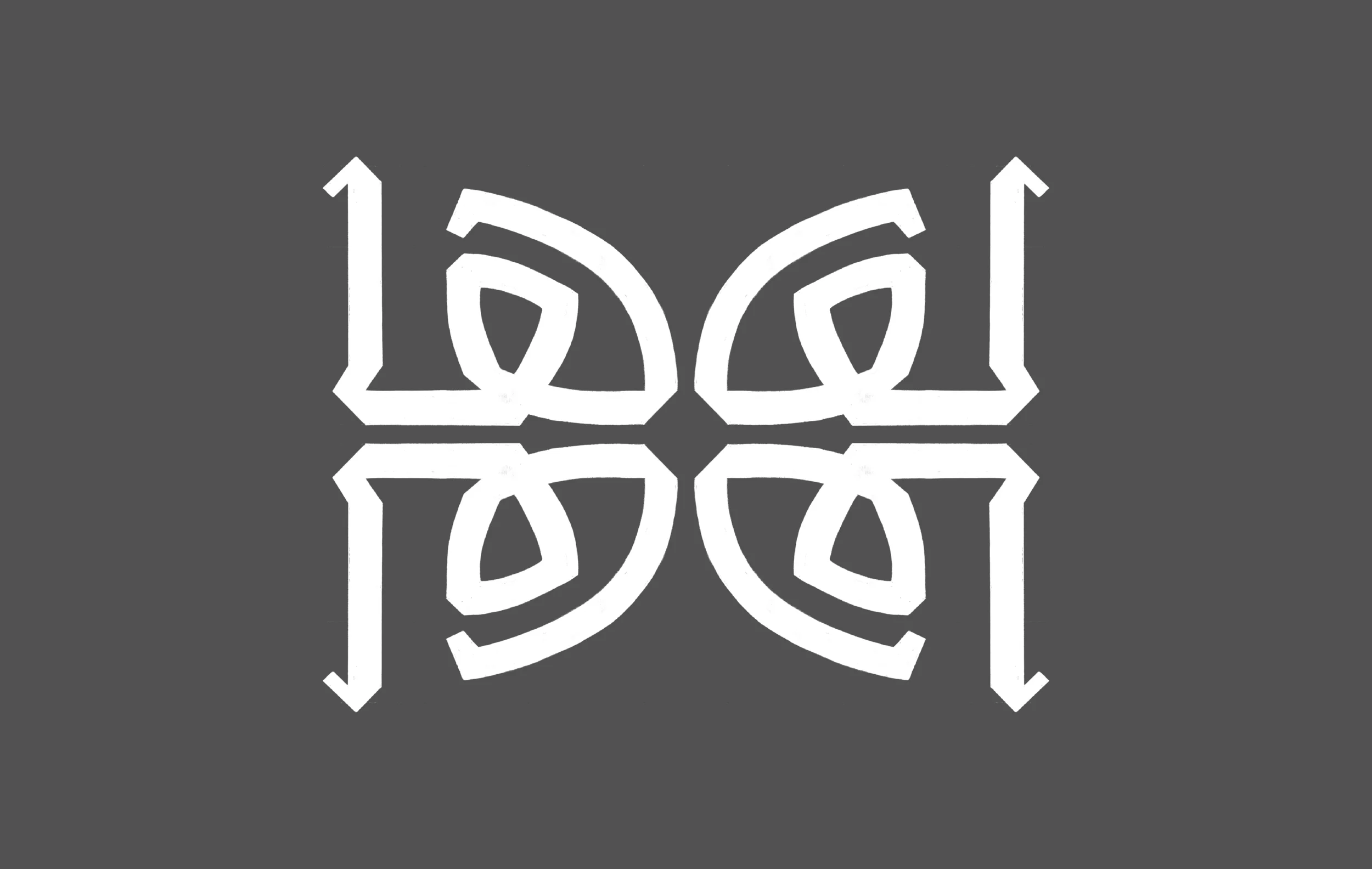
This one was tough. The letter Hā took a while till it was shaped in this form. I struggled with fluidity of the stroke movement. Well, the letter Hā - in my opinion - is one of the most beautiful Arabic letters because of its unique form. I had to set a new guide line, which is another loop height for this letter. I am not sure if this loop height well be applied to more letters. I might reduce the height of the letter, but not sure yet. I will be sure once I have a bigger set of letter forms. I am trying to use the modular approach to design some of the letter forms, but I end up starting from there, then tweak the lines here and there to form the new letter.

I am placing the letters next teach other in different context to see if there is harmony between them. So far, I don't feel that any of the letters looks odd in comparison to the rest. I think that I have to design some middle forms very soon.
Note: For non Arabic speakers/readers, the first image is not the letter form. It is the letter Hā repeated four times to form a pattern. Yes, I am just playing around.
