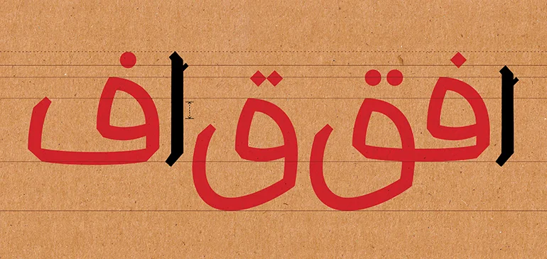
I've been away for a while. I was not lazy, but I was overloaded with school work and freelance projects. Actually, I've been working on the letters Fā’ & Qāf since my last post. It was tricky. Because the way I decided to design the initial Fā’ & Qāf and the isolated/terminal Fā’ without the Nuqta ended up almost being as high as the Alif which is problematic. So, a decision had to be made and I redesigned the Alif to be a bit taller as you can see above, on the left Alif.
This time, after doing many sketches, and scan them, I decided to digitize these letters using GlyphsApp which is an application for designing type. I learned how to use recently. I used to Robofont for Latin/Roman type design but never used it for Arabic. To be honest, when I compared both applications, Glyphs was much easier and intuitive. In addition, it makes life much easier when it comes to design Non-Latin type. I still did not dig deep in Glyphs but from the basics I learned, it seems promising.
Back to the letterforms..
I am also testing different kind of Nuqta. I experienced something while designing the isolated Fā’. Initially, I intended to have it sits straight on the baseline, but, it looked weird. So, I decided to have a little overshoot lower than the baseline which made it more natural and fluid. Also, I had to make the bowl of the Qāf a bit wider than the Sin because of needle eye/loop. I've already worked on the Waw letter but haven't had the chance to digitize it yet.