I've been away for a while. School started and I was out of town for few days. During that time, I was reading a book called Lettering & Type by Bruce Willen and Nolen Strals. Its a small book, simple, and practical in its approach. It tackles three main aspects: lettering, designing type, and designing with type. I am about to finish it. I will write another poster about it once I am done.
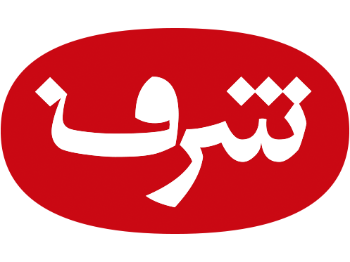
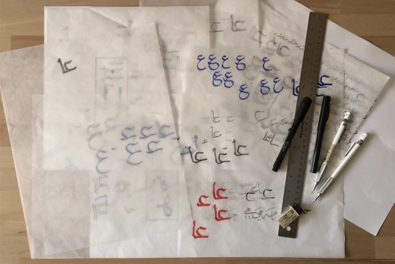
As for my typeface designing process. I started sketching the letter (ع) and I am facing some difficulties. One of the main challenges is that I am planing to design a modern typeface and I don't want to make it too calligraphic. So, when I picked Ijazah or Tawqi calligraphic script as a reference/inspiration, it created more challenges. Because of its very organic flow and nature, its making it harder to simplify it into a modern corporate type face. The original script has a great contrast between the thick and thins and I am planing to minimizing that.
A very good exercise I learned in Type@Cooper Condensed program is to sketch the skeleton of the letterforms first, and then using different kind of brushes and pens to draw the letter forms based on that skeleton. There are multiple factors that could play a huge role in defining that final letter forms and the contrast between the thick and thins:
- The tool you are using to draw/write to letterform.
- The angle and the thickness of that tool.
- The length of the ascenders, descenders, and their relationship to the x-height, loop height and the tooth heights.
- The speed and the pace of writing/drawing the letter forms could make a great deal of influence too.
So I am trying to apply different tools to the original skeleton of the letter to get the initial wanted look and feel of the letterforms.
Interesting: The common understanding of the signature (Tawqi in Arabic) is that its something written or drawn quickly. Yet, the Arabic script (Tawqi) is carefully drawn and astonishing when it comes to aesthetics.