The Journal

Decision made

Ijazah.jpg

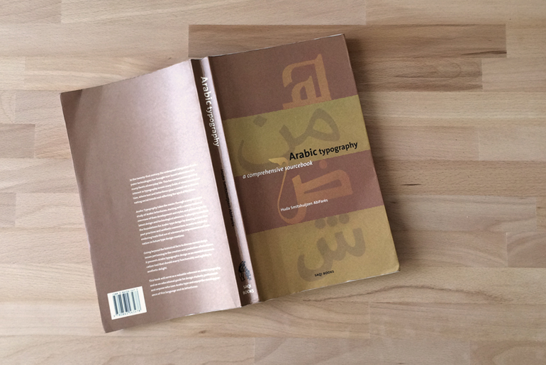
I decided what I want to do with the typeface I am going to work on. I am still confused if I should use the word typeface or font. Some one guide me into this please! Its going to to be a headline typeface. It will be modern and conventional. I will draw the letterforms based on the old Arabic calligraphic style: Ijazah or Tawqi' which was developed at the time of the Abassids dynasty. The Tawqi script was used in official signatures scripts. For non Arabic speakers, Tawqi' means signature, and Ijazah means certification. Ijazah/Tawqi' is also known for connecting the final letter of the word to the initial letter of the following word. It was often used for official documents and important references. I always loved this script because of pen flow while writing it. Its not very common as the rest of the main Arabic calligraphic scripts. Its a combination between Naskh and Thuluth which gives it great proportions. I will not design a revival of the script. I will only design the letter forms based on it.

three_letters.jpg

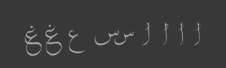
I learned that if I am designing a Roman typeface, I should start by designing the letterforms of the capitals H and O then the lowercase l,n,o, and to get the sense of proportions of the ascenders, descenders, x-height, capital, contrast, and letters width. For Arabic, I learned that I should start with the letters (ع ا س) to get the sense of the ascenders, descenders, loop and tooth heights, contrast, and letters width. So, there is nothing such as x-height in Arabic typefaces. In some Arabic typefaces, there are 2 loop heights. Sometimes, the loop and the tooth heights are the same.

I think, that the typeface I will be working on will end up being a mixture of my handwriting and Ijazah script letter forms skeletons.


Cultural Connectives

Cultural Connectives is a about bridging the gap between the Arabic and Latin alphabets
— Rana Abou Rjeily

Oh man! another book in such a short time. Well, this is the kind of book that you can finish reading in couple of hours. Its not that its a bad book or any of that, but it was designed and authored to be read this fast. 

I would say that this book has two main purposes; the first one is a short and quick guide for non Arabic speakers to learn the basic principles of the written Arabic. The other purpose is to show case the font that Rana designed which is called Mirsaal. It is a bilingual font (Arabic & Latin) that come in regular and bold. The Arabic version is based on what the Lebanese architect Nasri Khattar started in 1947 when he invented Unified Arabic. This invention was an Arabic font that is detached, to make it much easier to print using movable type. 

As for the book, as Rana said, its basically to bridge the gap. The book won't teach the reader how to design Arabic type. It is more on how written Arabic works, a bit about Arabic typography, and type design. The language and illustrations in the book are smart, simple and to the point. I believe that the main audience for this book would be non-Arabic speakers and designers who want to learn a bit about it to get familiar of the Arabic typography system. It was a good read and the way it was put together will help me in my thesis project. 

A Good Read

arabic_typography.jpg

In Things to Know page; I mentioned that do not like to read. I know its wrong, and I am ashamed to say confess, but I can't really remember when was the last time that I actually finished reading a whole book. 

Well, it seems that this is about to change. I've just finished reading Arabic typography: a comprehensive sourcebook by Huda Smitshuijzen AbiFaris which I started about a month ago. I learned a lot about typography in general and Arabic typography/type design in particular. In the book, I got to learn a bit of history, tools, classifications, sources, technological aspects, and many more things. In my opinion, the book does not have enough information to educate the reader about designing the letterforms, yet, I think it was a very good choice to read. It is written in a very simply language, yet reach with information. The book was published in 2001. Obviously, a lot of development occurred since then. If you are into Arabic type design, I highly recommend reading this book. 

Lets do it!

There is no singel, ‘correct’ process for creating a typeface. The methodologies of individual designers are as unique and varies as the designs themselves.
The urge to create can be quite quite personal; the impetus might even be an extension of a historical, intellectual or cultural inquiry
— Karen Cheng

I read the that quote in her book designing type. Its a book that many type designers find it useful in the process of designing the letterforms of a certain typeface. Actually, I think that the quote is a bit generic, but, its also true. 

After having a small talk with Nadine Chahine and reading her article and few other articles here and there about designing type. It only makes sense that the very first step of working on any design, including type design, is to know the purpose of the typeface, and the intended function/goal of this typeface. In a simple language, I have to answer this question: What is the function of the typeface, and when/where it will be used? 

So, I have to decide if the typeface will be a display/headline or a text typeface. If its a text typeface, is it a book text typeface or is it a newspaper text typeface. Moreover, I should know if the typeface will be used in print, or digital platforms. I guess I will spend sometime tomorrow trying to write a design brief about it, and I will post it here. 

Tiraz

Me and my friends visited the Metropolitan Museum of Art here in New York. We visited the Islamic section there. I remember that I saw few interesting letterforms and calligraphic styles, and they were a bit unusual to my eyes. 

Post5_1.jpg
Post5_2.jpg

So, after I did some readings yesterday, I thought I should take a break and go the the Met again. I went back to the Islamic section, and I found those interesting letterforms and inscriptions. They were inspirited textiles that all called Tiraz which comes from the Persian word for "embroidery." The one that were exhibited come from Iraq. I might use the letterforms as a base for the typeface I will be designing, but not very sure. I thought I should keep them in the journal anyways.