The Journal

New Choices & Decisions

New_Decisions.jpg

It has been a while since I published my last post. I've been busy with school, and other stuff. I have one more semester to go and the thesis project is consuming a lot of time! 

Also, as part of my research, I met Arabic calligraphers, type designers, teachers, and producers. I had wonderful talks, and benefited a lot from discussing my project with them. Also, I visited University of Reading in UK to meet Fiona Ross, and to check out their typography programs. They have a short course that is conducted in the summer. Also, they have another two programs; MA Typeface Design and MRes Typeface Design. I am actually considering registering for the short course during the summer! The great thing about this program is the fact that the teachers have expertise in designing Non-Latin type, including Arabic which will help me in my project!

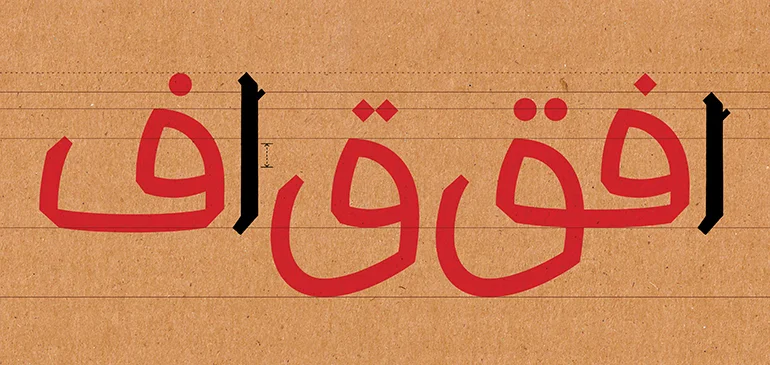
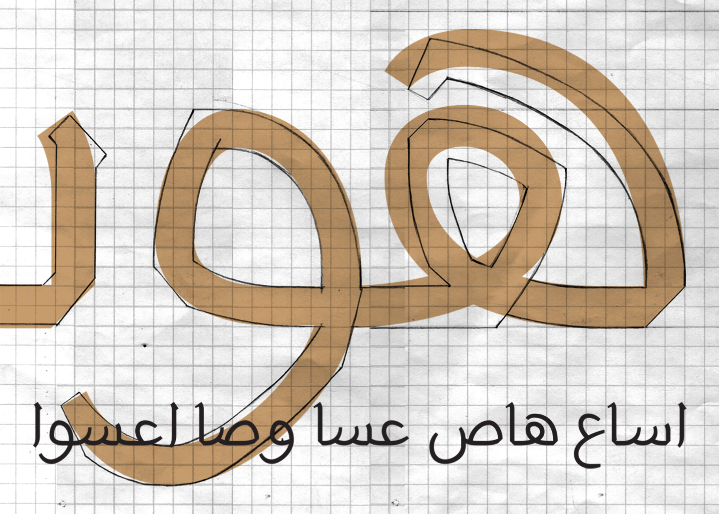
Now back to the typeface I am designing. It was a good exercise to leave the sketches for a while and getting back to them after a while. Now that I am working on designing the letterforms again, I made new decisions, and choices. So, I thought that the letterforms I designed previously were a bit rigid. For some reason, those angles did not look OK to me. As a result, I decided to make keep the same skeleton of the letterforms, but soften the angles. I definitely like the new forms more! I still have to work on the kerning, and proportions more though.

The image above shows the old angler sketches, and the new approach overlaying them. I produced some isolated, initial, and medial forms. So far, the letterforms do not have much contrast between the thicks and thins. They are more likely to be mono weight, except for some tips, and endings of the strokes. 

One more thing.. 

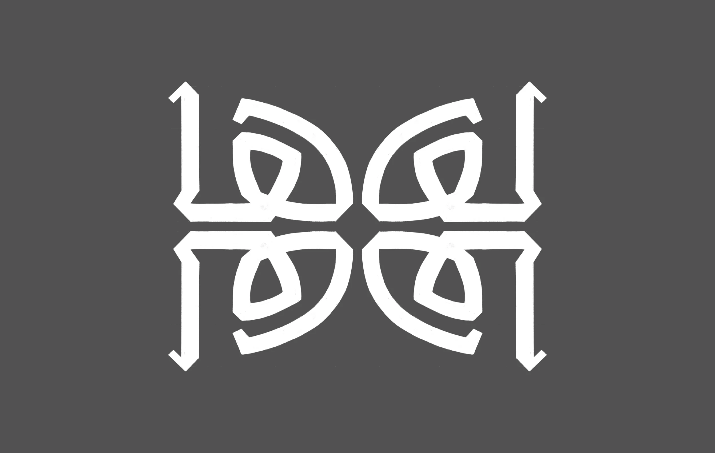
I think that this is going to end up being a "thin" weight of the typeface. I am saying that because when I compared it to another typefaces, it only matched the thin weight, but I will keep working on it as is anyways. 

Thoughts? feedback? Please do share them!

Fa’ & Qaf

fa_and_qaf

I've been away for a while. I was not lazy, but I was overloaded with school work and freelance projects. Actually, I've been working on the letters Fā’ & Qāf since my last post. It was tricky. Because the way I decided to design the initial Fā’ & Qāf and the isolated/terminal Fā’ without the Nuqta ended up almost being as high as the Alif which is problematic. So, a decision had to be made and I redesigned the Alif to be a bit taller as you can see above, on the left Alif. 

This time, after doing many sketches, and scan them, I decided to digitize these letters using GlyphsApp which is an application for designing type. I learned how to use recently. I used to Robofont for Latin/Roman type design but never used it for Arabic. To be honest, when I compared both applications, Glyphs was much easier and intuitive. In addition, it makes life much easier when it comes to design Non-Latin type. I still did not dig deep in Glyphs but from the basics I learned, it seems promising.

Fa_and_qaf_II.jpg

Back to the letterforms.. 

I am also testing different kind of Nuqta. I experienced something while designing the isolated Fā’. Initially, I intended to have it sits straight on the baseline, but, it looked weird. So, I decided to have a little overshoot lower than the baseline which made it more natural and fluid. Also, I had to make the bowl of the Qāf a bit wider than the Sin because of needle eye/loop. I've already worked on the Waw letter but haven't had the chance to digitize it yet.  

Kuwait National Assembly Logo شعار مجلس الأمة الكويتي

Image credits: @kuwaitnews (http://www.kuwaitnews.com)

Image credits: @kuwaitnews (http://www.kuwaitnews.com)

هذا الموضوع مختلف قليلا ، و لكن ، اعتقد انه من المفيد البحث فيه كحالة دراسية 

بالأمس ، تم الإعلان عن الفائز في مسابقة تصميم شعار مجلس الأمة الكويتي ، و الشعار الفائز هو الموضح بالصورة أعلاه. و قد كان آخر موعد لتسليم الشعارات المشاركة في المسابقة في شهر مارس الماضي على ما اعتقد ، وقد قمت بالمشاركة في هذه المسابقة ، و لم أكن الفائز فيها. قبل الحديث عن الشعار الفائز ، و الأسباب التي تجعلني اعتقد أن الشعار الفائز يعتبر شعار سيء ، أود أن أوضح أنني و لحد الآن ، لا أعرف أي شيء عن مصمم الشعار الفائز ، و إنني عندما انتقد ، فإنني لا اقصد أن اسخر من اي شيء و لا أي شخص ، نقدي فني و احترافي فقط ،  بالإضافة إلى ذلك ، أود أن أذكر أنني ضد إقامة أي مسابقة لتصميم شعار ، خصوصا اذا كانت للعامة ، و عندما تكون لجنة التحكيم غير مختصين بالتصميم الجرافيكي أو الهوية ، قد يكون الفنانون التشكيليون إضافة للجنة التحكيم ، ولكن تحكيمهم يأتي من وجهة نظر مختلفة تماما عن وجهة نظر المصمم المختص 

This is not a typical post, but I thought I should bring it in as a case study.

Yesterday, the winner of the National assembly logo design contest was announced. I t is the one in the image above. The deadline for submitting your entry for this contest was last March I think. I personally submitted an entry but it did not make it through. Before digging into the winner logo, and the reason makes me think that its a bad logo, I need to make it clear, that at this point, I know nothing about the designer/winner. If I am criticizing, I am not making fun of anyone or anything. I am not making jokes just for the sake of it. I am basing my criticism solely as a professional. In addition, I have to mention that I am always against logo competitions, specially if its for the public, and the judges are not experts, or specialized in branding and graphic design. Fine artist could be great addition to the judging committee, but their judgment comes completely from a different point of view.

في الصورة التالية تجدون الشعار الذي قمت بالمشاركة فيه ، عندما كنت أعمل على تصميم هذا الشعار ، وضعت بعين الاعتبار أن الشعار رسمي ، حديث ، و يتماشى مع أمثاله من شعارات البرلمانات و المجالس في مختلف دول العالم ، شخصيا ، لا أعتقد أن الشعار ممتاز ، لكني اعتقد انه انسب من الشعار الفائز بالمسابقة 

The image below is the logo I submitted. When I was working on it, I made sure that it is formal, modern, and analogous to another logos for similar organizations around the world. I don’t think that its the best thing I’ve ever done, but I would argue that it is working better than the winner. 

national02.jpg

السؤال ، لماذا اعتقد أن الشعار الفائز سيء؟ 

بما أن هذا الموقع يختص بالخطوط الطباعية، سأبدأ بالحديث عن هذا الجانب. بالنسبة للخط العربي، فهو مبني على الشعار و اللافتة المستخدمة سابقا، و لكن هو إعادة تنفيذ سيئة للشعار السابق، من الواضح انه تم بذل مجهود و تم الانتباه اكثر عندما تم تصميم الخط العربي للشعار السابق. و لكن ، الشعار الفائز الحالي مليء بالأخطاء و المثالب. على سبيل المثال، هناك العديد من علامات التشكيل الجمالية الخارجة عن الحاجة، عدد لا بأس به من هذه العلامات تحتوي حلقات مغلقة ضيقة جدا و صغيرة، و بالتالي أصبحت مغلقة. النقاط صغيرة جدا نسبة إلى سمك الأحرف، طريقة رسم الحروف سيئة، و ليست انسيابية، و غير مترابطة من حيث الشكل مع بعضها البعض، و عند التركيز تجدون أن هناك زوايا غريبة ، و بروزات غير مبررة في بعض الأحرف.  لست مقتنع تماما باستخدام خط تقليدي، كلاسيكي، و لكني لا أعترض عليه إذا تمت كتابته و تصميمه بشكل متقن. أما بالنسبة للخط الانجليزي، الخط نفسه غير صالح أبدا ، ضعيف جدا، هو غير رسمي، بعض الحروف شكلها غريب، حرف ال O مثلا يميل إلى كونه مربع، و حرفين الSS يبدوان كأنهما مقلوبان، و المسافات بين الأحرف غير متوازنة. عند النظر لكلمة NATIONAL، نجد أن حرف الA و حرف الL ملتصقين، و الحالة تتكرر في حرف الA و حرف الS في كلمة ASSEMBLY و هذا خطأ، و هناك مسافة كبيرة بين NATION و AL مما يجعلهما و كأنهما منفصلين عن بعض لتبدو الكلمتين كأنهما NATION AL ASSEMBLY ، بالإضافة لذلك، الخط الانجليزي مختلفة جدا عن الخط العربي ولا يتناسق معه، و هو خط غير رسمي، بالإضافة إلى كونه اصغر حجما من الخط العربي بشكل ملحوظ. لذلك، عندما يتم تصغير الشعار عند طباعته على كرت مثلا، سيؤدي ذلك إلى مشكلة. الخط العربي فيه مساحات فارغة كبيرة لا تتفق مع ضيق مساحات الخط الانجليزي، فهو محكم و ضيق المساحات. أخيرا، أنا اعتقد أن اقتصار الكتابة على مجلس الأمة، يعتبر خطأ، لأنه لا يحمل أي دلالة عن الكويت. على سبيل المثال، لو تم طباعة الشعار على مستند أو تطبيق و تم استخدامه خارج دولة الكويت، لن يرمز لها بشيء 

So, why would I think that this is a bad logo?

Since this journal is about typography, lets start with it. As for the Arabic part of it. It is based on the old signage of the building. Yet, it is a bad imitation of it. There were more effort and considerations when it was designed previously. This one has a lot of errors. For example, there are a lot of diacritics marks, that are not needed. Many of these diacritic marks have small counters, and eventually they are blocked. The dots ‘Nuqat” are small and weak if you compare them to the thickness of the script itself. The letter forms are badly constructed and they are not fluid and there is no consistency, nor harmony between them. If I zoom in, I would find many weird angles and bumps here and there. I am not crazy about using a classical script for Arabic part, but I don’t mind it as well, if it was done properly. When it comes to the Latin/Roman typography, the typeface is a big NO. It is not formal, there are some letter forms that look weird. For example, the O is squarish, the SS look like they are upside down. The spaces between the letters (kerning) are not balanced at all. In the word NATIONAL, the A and L are attached, similar to the A and S in the word ASSEMBLY. There is a big space between NATION and AL which confused the reader. Now it looks like NATION AL ASSEMBLY. The Latin/Roman typography does not match the Arabic at all. It is was different and far from being formal. It is much smaller than the Arabic too. So, if you print the logo on a business card, or in a small scale in general, it will be problematic. The Arabic typography is very open and spacious, but the Latin/Roman  typography is not. It is congested and tight. Finally, I believe its wrong to call it National Assembly مجلس الأمة . Why? It does not say anything related to Kuwait! So, if this logo was printed on a document where it was used in a different country, it won’t relate to Kuwait. 

q8_national_assembly-01.jpg

لنتكلم الآن عن الرمز. لسبب ما لا أعرفه، عناك خطوط تحديد سوداء على بعض الأجزاء دون أخرى، و هذا شيء غريب و لم أجد له تفسير منطقي. شكل الرمز هو تبسيط و تجريد لمبنى مجلس الأمة، والذي يعتبر اتجاها معقولا و منطقيا، و لكن طريقة تصميمه و رسمه غير رسمية، و غير مميزة، و هذا لا يمثل كون المجلس مؤسسة رسمية مرموقة، الظل المستخدم خطأ كبير، و هو غير عملي اذا ما تم استخدام الشعار نفسه في تطبيقات مختلفة. قد يكون الموضوع متعلق بالذوق الشخصي، و لكني أرى أن الشكل الجمالي للشعار سيء، فهو مشابه للعديد من الشعارات الأخرى التي يتم تداولها أصلا في الكويت، أو على الإنترنت. العمود الأسود في المنتصف شكله غريب و غير متناسق مع باقي الشعار، و يؤدي إلى كون الجانب الأيسر من الشعار ضعيف و غير متزن مع الجانب الأيمن منه. الجانب الأيمن ملون ، و الجانب الأيسر أبيض، لهذا لا يوجد توازن. لا استطيع تصور الشعار بلون واحد فقط و الذي قد يكون أحد التطبيقات التي يتم احتياجها. أخيرا، أنا اعتقد أن الرمز لم يتم تنصيفه تماما بالنسبة للشعار ككل، أو على الأقل، العمود الأسود يخل بالتوازن بصريا 

باختصار، أنا اعتقد أن الشعار يحمل صورة سيئة، و تم تصميمه بشكل سيئ من الناحية الجمالية و التقنية، و لا يوجد ترابط و تناغم بين الخط و الرمز، و لا يوجد ترابط أيضا بين الخط العربي و الانجليزي

OK, now lets talk about the icon/symbol. For some reason, there is a black stroke on some parts only, without the rest of the logo, which I think is odd, and I could not find a reason for such thing.  The shape is an abstract form of the building, which makes sense, but it looks playful, generic and informal which does not represent the subject. The shadow that appears in the symbol is a big mistake. It is not practical, and can not be applied in different occasions where the logo will be used. Aesthetically, and this might be a matter of taste, I believe that the logo looks bad, It looks like so many other logos that you can find around Kuwait, or on the Internet. The black column in the middle looks very odd and distracting and it is making the left part of the icon very week. The right part is colorful and heavy, yet the left part is all white . So, there is no balance. I cant imagine the whole icon being one solid color. Finally, I think that the icon is not placed properly in the middle of the whole logo, or, at least, because of the black column, optically, it does not look centered. 

To summarize, I think that the logo gives the wrong image, it is badly design, technically, and aesthetically. There is no connection between the symbol and the typography, nor between the Arabic and Latin/Roman typography. It is not practical form to use. 

اذا كنتم تتفقون مع ما كتبت، أو لا تتفقون معه، و اذا كنتم تودون إضافة اي معلومة للموضوع، ارجوا المشاركة لكي نساهم في جعل هذا النقد بناء و مفيدا من وجهة نظر فينة و تقنية، و هذا افضل بكثير من السخرية من سوء الشعار فقط

If you agree or disagree with me and If you would like to add anything, please share your thoughts. Lets contribute in making this a constructive criticism from a professional point of view, instead of just making fun it. 

Arabic Typography Bookshelf

Books.jpg

Part of my research was to look for books on designing with Arabic type, or designing Arabic type. Well, as expected, the books in the image above are almost all the books available on the subject, maybe couple more. In addition, maybe there are few more but they are not written in English, nor Arabic. 

In all cases, this research was interesting. One finding is that there are not many of them, comparing to the books on Latin/Roman typography and type design. In addition, the 12 books above cost more than $800, excluding the cost of delivery/shipping. So, the average price for a book on Arabic typography is almost $70, which is expensive. Just for the sake of comparing prices, I went to Amazon.com and searched for books on Latin/Roman typography and calculated the accumulated price of 50 books, and the total was $740, which means that the book average price is about $26. So, the problem is not only the lack of resources on Arabic type, its also the fact that they are expensive!

Anyways, in the list below are you can find the books I found on Arabic typography, as they are numbered in the image above. If you are interested in buying any of them, just click on the title: 

  1. Sculpting Type
  2. Arabic Type Design for Beginners
  3. Arabic Font Specimen Book 
  4. Typographic Matchmaking in the City
  5. Typography Matchmaking
  6. Arabic Typography
  7. Arabesque 1
  8. Arabesque 2
  9. Writing Arabic
  10. Talking About Arabic
  11. Cultural Connectives
  12. Arabic for Designers

If you know more books that you would like to add to the list, please let me know! I am looking for more resources!

Tough One

Ha_pattern

This one was tough. The letter  took a while till it was shaped in this form. I struggled with fluidity of the stroke movement. Well, the letter Hā - in my opinion - is one of the most beautiful Arabic letters because of its unique form. I had to set a new guide line, which is another loop height for this letter. I am not sure if this loop height well be applied to more letters. I might reduce the height of the letter, but not sure yet. I will be sure once I have a bigger set of letter forms. I am trying to use the modular approach to design some of the letter forms, but I end up starting from there, then tweak the lines here and there to form the new letter.  

ha_and_more.jpg

I am placing the letters next teach other in different context to see if there is harmony between them. So far, I don't feel that any of the letters looks odd in comparison to the rest. I think that I have to design some middle forms very soon. 

Note: For non Arabic speakers/readers, the first image is not the letter form. It is the letter Hā repeated four times to form a pattern. Yes, I am just playing around.